
Grid System: Most of the time, web designers stuck between the flow and look of a website layout when he/she designing it on a graphic designing software (for ex. Photoshop). This is just because of not maintaining a proper Grid System. As a default I prefer the 960 grid system of 12 columns. But there are so many Grid Systems on the web. It may 12 columns, 16 columns or 24 columns.
Some Grid Systems are fixed in width and some are fluid. Fixed in the sense the size of the Grid System or the layout of the Grid System always maintain a fixed width across all devices. It may a PC, a laptop or a cellphone. But in fluid Grid System, as the width of the device changes, it automatically adjusts its width according to the device width. It is possible because the width of Grid System is coded in Percentage ( % ), not in Pixel or Point.
I've collected some of the best Grid System from the web and I would love to share them with you. So that you can develop a better website within a few hours without thinking about the proportions. Because if you follow the Grid, it will lead you to a proper well balanced website layout. Have a happy web designing. :)

1. Bootstrap
Sleek, intuitive, and powerful front-end framework for faster and easier web development.

2. 960 Grid System
The 960 Grid System is an effort to streamline web development workflow by providing commonly used dimensions, based on a width of 960 pixels. There are two variants: 12 and 16 columns, which can be used separately or in tandem.

3. Metro UI
Metro UI CSS allows to create a Web site in the style of Windows 8 quickly and without distractions on routine tasks.

4. Responsive Grid System
Spectacularly Easy Responsive Design .The Responsive Grid System isn't a framework. It's not a boilerplate either. It's a quick, easy & flexible way to create a responsive web site.

5. Blueprint
Blueprint is a CSS framework, which aims to cut down on your development time. It gives you a solid foundation to build your project on top of, with an easy-to-use grid, sensible typography, useful plugins, and even a stylesheet for printing.

6. Fluid 960 Grid System
Templates for Rapid Interactive Prototyping

7. The Semantic GRID SYSTEM
Set column and gutter widths, choose the number of columns, and switch between pixels and percentages.
All without any .grid_x classes in your markup. Oh, and did we mention it's responsive?
Runs on LESS, SCSS, or Stylus.

8. YUI CSS Grid Builder

9. 34 RESPONSIVE GRID SYSTEM
34Grid is a Responsive Grid System based on "equally distributed columns" layout basis. In contrast to other great grid systems, 34Grid provides equally distributed columns for each row. (and also column complements for inequal distributions).
If you're already familiar with grid systems and responsive web design just create&download a bundle and see what is inside. Else you may start with resizing your browser window.

10. gridr buildrrr

11. Grid Calculator
Change the settings (by dragging the sliders, clicking on the bars, or editing the values) to calculate the overall width of your grid.

12. Grid System Generator
The grid system generator will create custom grid systems in valid css / xhtml for rapid prototyping, development and production environments.

13. the-golden-grid
The Golden Grid is a web grid system. It 's a product of the search for the perfect modern grid system. It 's meant to be a CSS tool for grid based web sites.

14. YamL: 4 CSS Framework
A modular CSS framework for truly flexible, accessible and responsive websites
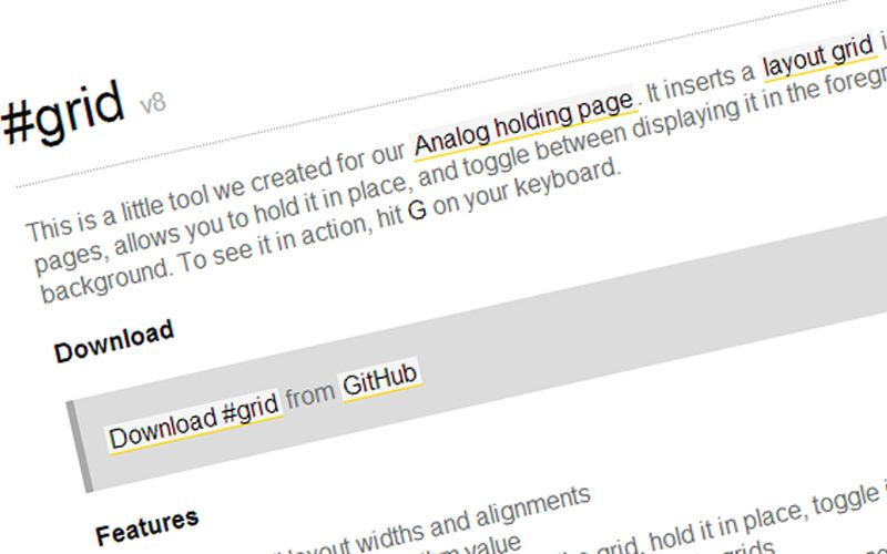
15. #grid
It inserts a layout grid in web pages, allows you to hold it in place, and toggle between displaying it in the foreground or background.

16. Modular Grid